Within the page header, most of the available pages have a view configuration section, where general view parameters for this page may be selected by using pull-down menus.
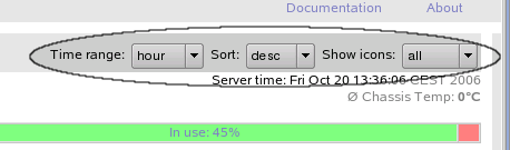
This pull-down menu defines the time range for historical data displayed on the current page. This time range is used for history charts, event lists and similar information, where a period of time beginning now and going back in time is required.
Within the parameter browser, this pull-down menu selects the column used for sorting.
This pull-down menu defines the sorting order for all types of lists displayed. Ordering can be ascending or descending.
This pull-down menu defines which node icons are shown in the icon area. Node icons are selected by the current node state. Available selections are:
Table 6.1. Icon selection
Entry Description all all node icons are shown idle only icons for idle nodes are shown in use only icons for used nodes are shown (load1 > 0.1) ev.pnd only icons for nodes having pending events are shown dead only icons for dead nodes are shown ev+de only icons for nodes which are dead or have pending events are shown The default icon state can be configured using the variable
Matchwithin the GridMonitor GUI configuration. See the section called “Configuring GridMonitor GUI default values” for details. All icons are shown in a color representing the current node state. See glossary section for details about node states and colors.Figure 6.4 shows an example icon area indicating different kinds of node states.
In this example, nodejuli-cn026-cis currently unavailable, all other nodes are either idle or in use.For a short-hand for the icon pull-down menue, click on the appropriate section of the loadbar to get a list of icons with the selected state.
Tip
To save display space in the browser window, select
'ev+de'to only show icons for nodes requiring the administrators attention. Nodes running under normal conditions are typically not of interest. This is especially true for large clusters, as the icon area would fill up the browser window.

Other view configuration pull-down menus not shown in the above example include:
This pull-down menu defines available columns within tables, which might be used for sorting. This menu is available within the parameter browser.
- ,
This pull-down menus allows you to narrow the list by the selected queue and job state.